

Exploring Color Theory for Stunning Interior Design Transformations
Color shapes how we experience spaces. It influences mood, perception, and even behavior. Understanding color theory can transform your
interior design projects from ordinary to extraordinary. This guide breaks down the essentials of color theory and shows how to apply it effectively to create beautiful, balanced interiors.
The Basics of Color Theory

Color theory explains how colors interact and how they affect human perception. It revolves around the color wheel, which organizes colors into primary, secondary, and tertiary groups.
Primary colors: Red, blue, and yellow. These cannot be created by mixing other colors.
Secondary colors: Green, orange, and purple. Made by mixing two primary colors.
Tertiary colors: Created by mixing a primary and a secondary color, such as blue-green or red-orange.
Understanding these categories helps you mix and match colors that work well together.
How Colors Affect Mood and Space
Colors evoke emotions and influence how we feel in a room. They can make a space feel cozy, energetic, calm, or spacious.
Warm colors like red, orange, and yellow create energy and warmth. They work well in social spaces like living rooms or kitchens.
Cool colors such as blue, green, and purple promote calm and relaxation. Bedrooms and bathrooms benefit from these tones.
Neutral colors like beige, gray, and white provide balance and act as a backdrop for other colors.
The size of a room also affects how colors feel. Dark colors can make large rooms feel more intimate, while light colors open up smaller spaces.
Color Harmonies for Interior Design
Color harmony means combining colors in a way that is pleasing to the eye. Here are some common harmonies used in interiors:
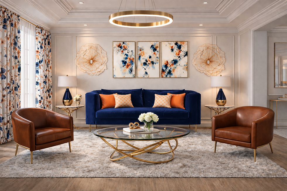
Complementary colors: Colors opposite each other on the wheel, like blue and orange. They create contrast and energy.
Analogous colors: Colors next to each other, such as blue, blue-green, and green. These produce a calm and cohesive look.
Triadic colors: Three colors evenly spaced on the wheel, like red, yellow, and blue. This scheme offers vibrant contrast while maintaining balance.
Monochromatic colors: Variations of a single color using different shades and tints. This creates a sophisticated and unified feel.
Choosing the right harmony depends on the mood you want and the function of the room.
Practical Tips for Using Color in Interiors
Applying color theory to real spaces requires thoughtful planning. Here are some practical tips:
Start with a focal point: Use a bold color on a feature wall or a statement piece of furniture.
Balance bold colors with neutrals: This prevents overwhelming the space and keeps it inviting.
Use color to define zones: In open-plan spaces, different colors can separate living, dining, and work areas.
Consider lighting: Natural and artificial light change how colors appear. Test paint samples at different times of day.
Incorporate textures and patterns: These add depth and interest, especially when using monochromatic schemes.
Examples of Color Theory in Action
A living room painted in soft blue (cool color) with orange cushions (complementary color) creates a lively yet relaxing atmosphere.
A kitchen using shades of green and yellow (analogous colors) feels fresh and inviting.
A bedroom with varying shades of gray (monochromatic scheme) combined with white accents offers a calm retreat.
A dining room with red, yellow, and blue accessories (triadic colors) energizes the space without clashing.
Avoiding Common Color Mistakes
Even with good knowledge, mistakes happen. Watch out for these pitfalls:
Using too many bold colors at once, which can make a room feel chaotic.
Ignoring the effect of lighting on color perception.
Choosing colors that clash with existing furniture or flooring.
Forgetting to test paint samples on large surfaces.
Taking time to plan and experiment helps avoid these issues.
The Role of Color Psychology in Design
Color psychology studies how colors influence emotions and behavior. Designers use this to create spaces that support specific activities.
Red can increase energy and appetite, ideal for dining areas.
Blue lowers heart rate and promotes focus, perfect for home offices.
Yellow stimulates creativity and happiness, suitable for kitchens or playrooms.
Green reduces stress and improves concentration, great for bedrooms and study areas.
Understanding these effects helps tailor interiors to the needs of occupants.
Using Color to Enhance Architectural Features
Color can highlight or downplay architectural elements:
Painting trim or moldings in a contrasting color draws attention to details.
Dark colors on ceilings can make rooms feel cozier.
Light colors on walls with dark floors create a grounded yet airy feel.
Using color gradients or ombre effects adds visual interest to plain walls.
Strategic color placement enhances the overall design and flow.
Sustainable and Timeless Color Choices
Trends come and go, but some colors remain timeless. Neutral palettes with pops of color offer flexibility and longevity. Sustainable design also encourages using natural pigments and eco-friendly paints.
Choosing colors that age well and reflect personal style ensures your interiors stay fresh and inviting for years.

Comments